On Tuesday, Chicago held the first round of their mayoral election. DDHQ extensively covered the election, including posting a nifty precinct-level map of results. The map features not just this week’s results, but also some overlap maps of socioeconomic factors.
Precinct-Level Results
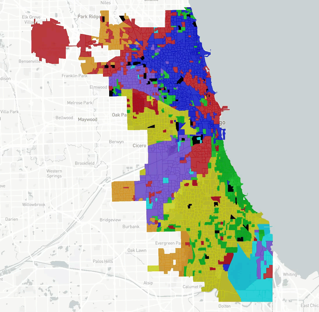
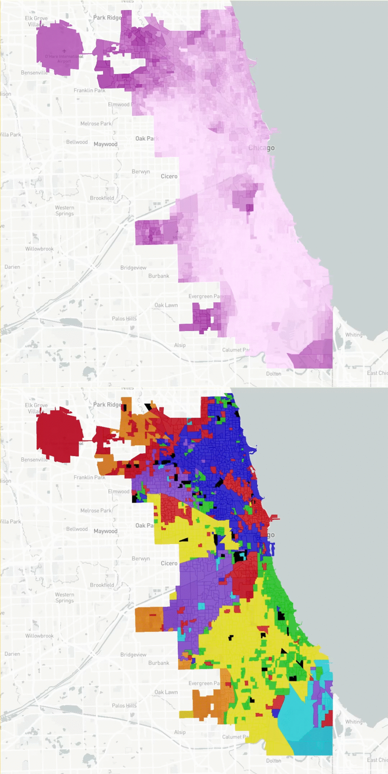
Lightfoot- Blue
Preckwinkle- Green
Daley- Red
Wilson- Yellow
Mendoza- Purple
Joyce- Orange
Chico- Light blue
The interactive map lets you zoom in on individual precincts and explore. With this tool, there are some interesting trends that can be highlighted about the support base of some of the major candidates:
Lori Lightfoot
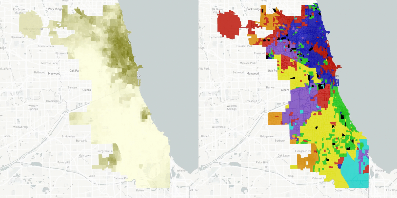
Both candidates advancing to the runoff are female African Americans. However, The areas of highest African American concentration in the city did not evenly split their vote between these two. Lightfoot’s support actually comes primarily from white college-educated areas on the North Side. The GIF below flips between the results map above and an overlay of the White college-educated population. Precincts Lightfoot won are in blue.
Toni Preckwinkle
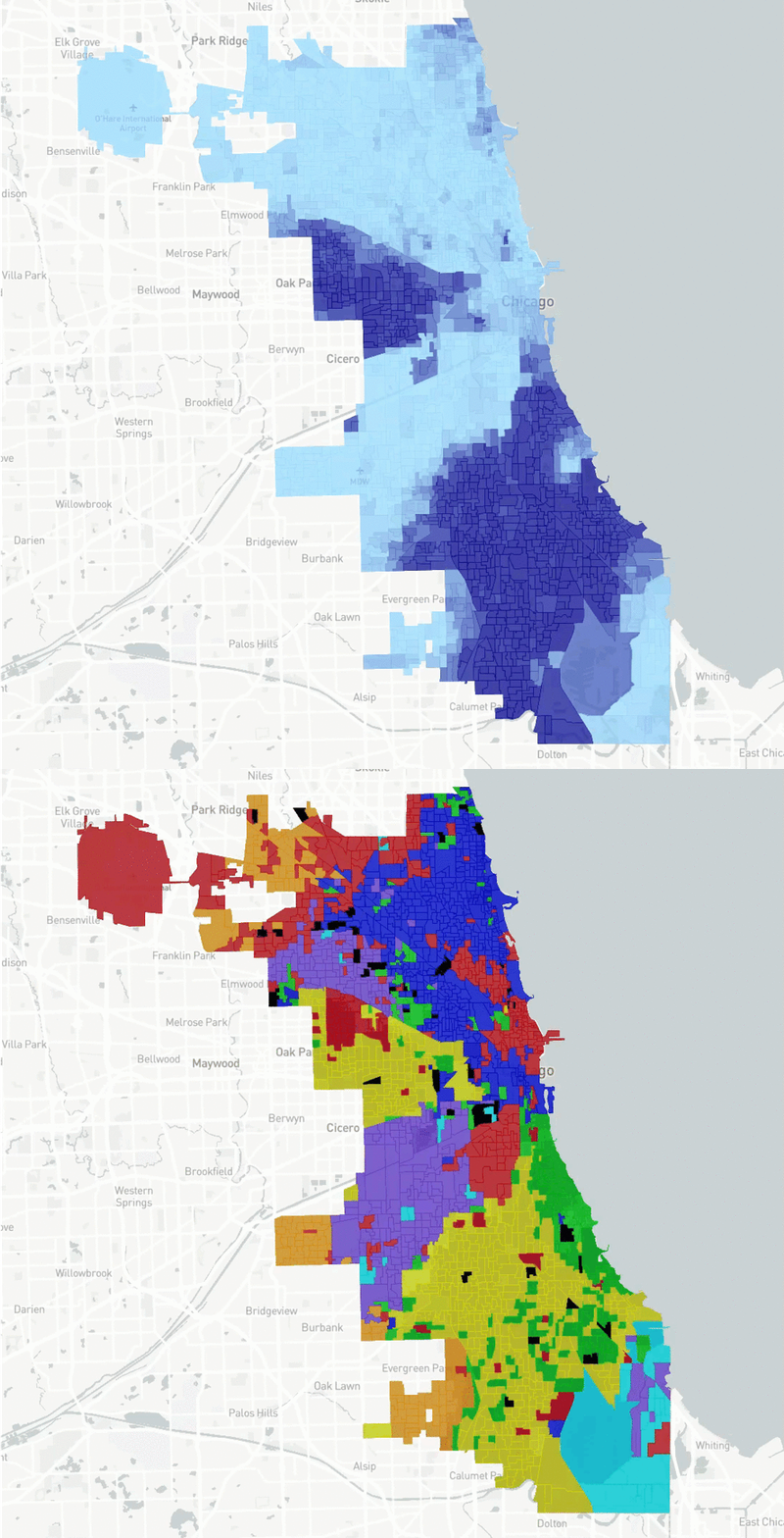
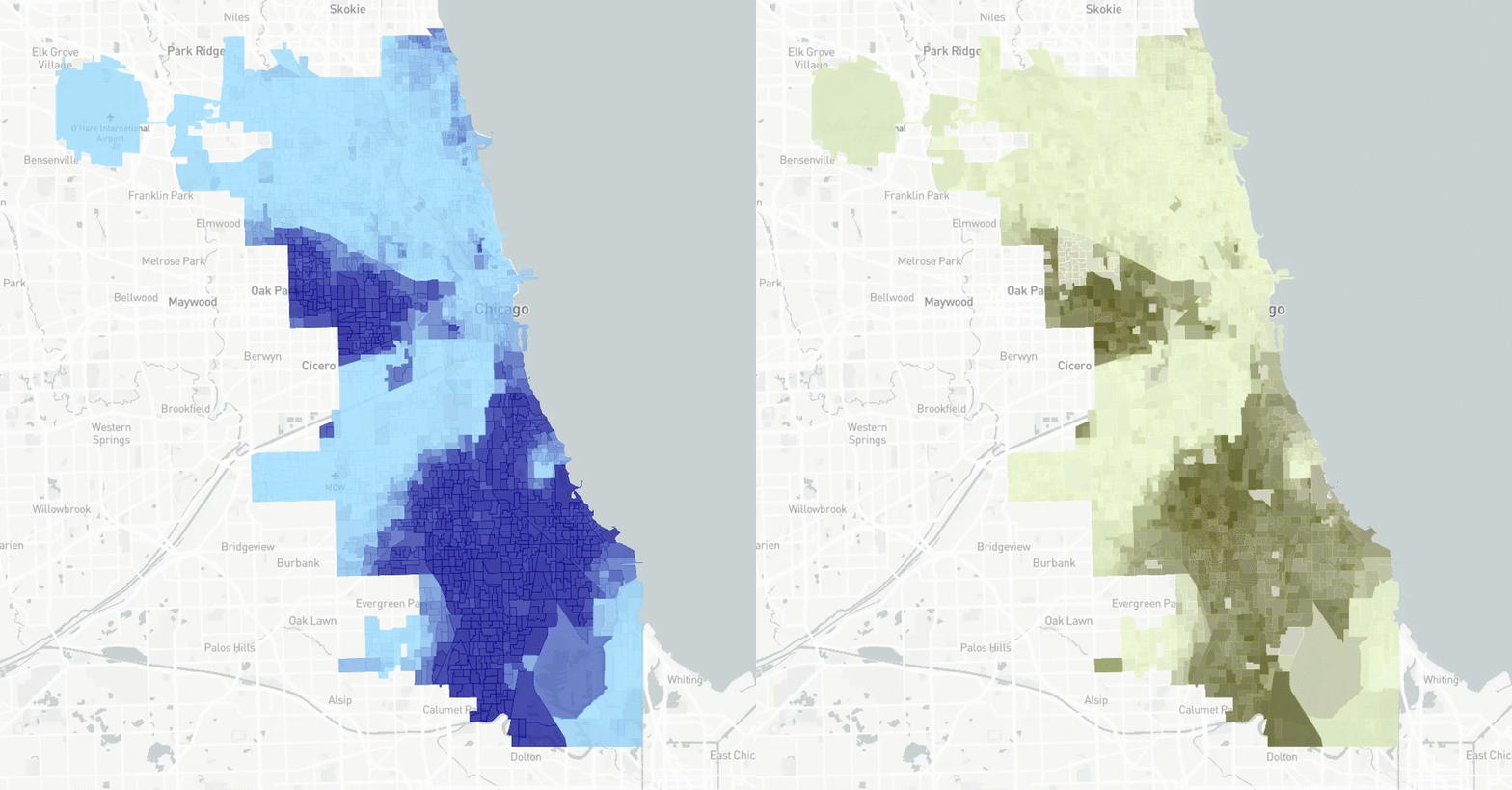
On the other hand, Preckwinkle’s support does come primarily from predominantly African-American areas on the south side, particularly in and around the 4th ward, which she used to represent. Preckwinkle is in green below; the results are compared to the African American population. Wilson’s precincts won are in yellow. The correlation between support in Preckwinkle or Wilson and African-American population is very strong.
Bill Daley
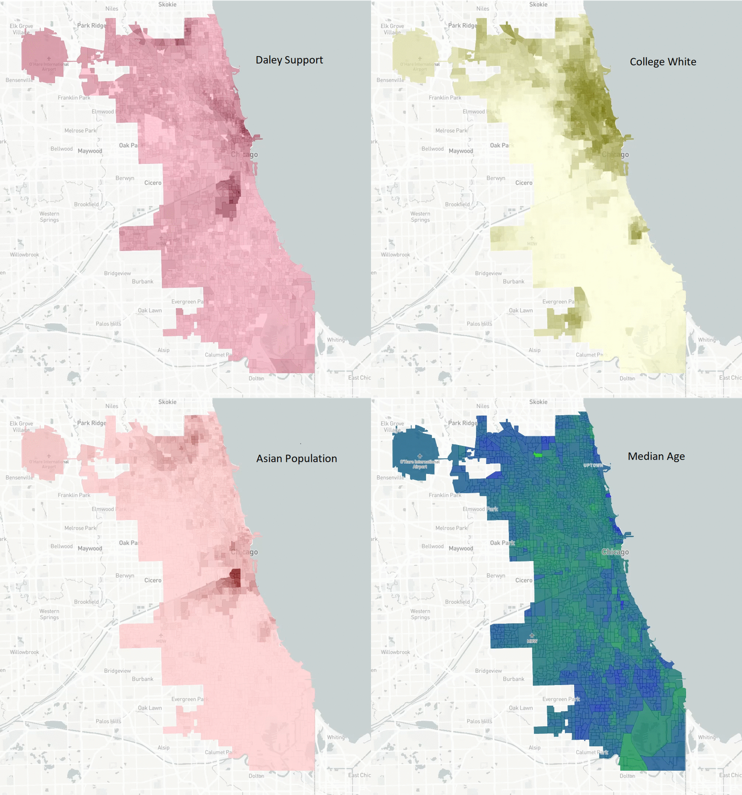
Daley’s base of support comes primarily from areas near downtown, as well as pockets of support near O’Hare and Oak Park. Unlike other candidates, his support cannot be primarily based to one factor. Precinct-level support for Daley moderately correlates with whites with college degrees, median age (older is more supportive), household income (higher is more supportive), and the Asian population. The maps below cycle through these factors. Daley support is in red.
Willie Wilson
Along with Preckwinkle, Wilson’s support comes from primarily African-American areas. Rather than drawing from areas along the lake, Wilson drew votes in a pattern that was nearly identical to his support when he ran for Mayor in 2015. The map below compares support for Wilson (yellow) with the African-American population (blue). Wilson is strongest throughout, except for Preckwinkle’s base of support.
Susana Mendoza
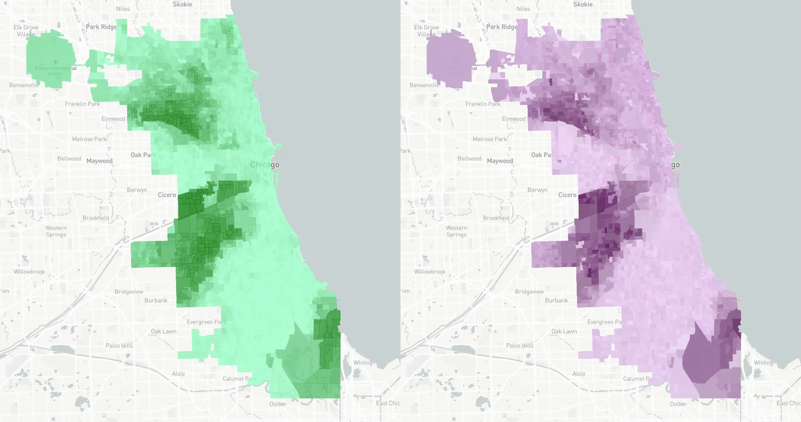
Mendoza’s base was in the heavily Latino precincts near Gage Park, to the east of Midway Airport. This should come as no surprise- she used to be the district 1 state representative, which overlaps with these precincts. Mendoza is in purple below, and flips between the results and the Latino population in green.
Jerry Joyce
Joyce’s base of support comes primarily from non-college educated whites on the outskirts of town. These are also the few areas of Chicago that voted Trump in 2016, and their support of Joyce may have cost Daley a spot in the runoff. Joyce is in orange below, and the results map is compared to the concentration of non-college educated whites.
Sum-up
Based on initial polling, it appears Lightfoot has the early edge. With a large amount of undecided voters and nearly 70% of all voters’ first choice not making it to the runoff, the race is very much open at this time. Either way, this is shaping up to be an interesting north side vs south side battle.