The clash between ideological sides within each party is often focused on the direction of where to move the party, but some energy focuses on electability. Moderates claim that they appeal to the center and scoop up more voters, while those that are more ideologically homogenous claim that they alone excite new voters, as their positions are the true popular ones. There is an enormous amount of ground to cover in these arguments, so I’m going to focus on one aspect and review US House elections and candidate performance by ideology.
Methodology
Ideology is a tricky thing to measure. The default reference you’re probably familiar with is the DW-NOMINATE score, measured on two scales plotting ideology as best as it can using roll call votes. These votes however present a slew of problems, from ignoring committee votes to leadership pressures. For this piece, I am using another measure called DIME, compiled by Adam Bonica, an Assistant Professor in the Department of Political Science at Stanford University. Bonica’s system works by looking at overlapping donors with known ideologies to compile a network of groups to discern a candidate’s ideology. This is an innovative way of tackling the problem: it provides an ideological measure that can look at challengers and incumbents and away from the pressure votes that may keep them “in line”. This dataset does not have the most updated numbers, so all measurements below will be using data from 2008 and 2012. In addition, I have filtered out any candidates with less than fifty distinct donors as a quality filter for the data. For all the House and Presidential results, I used the dataset from Elliott Morris, and checked it against the results I’ve had from official reports.
Charts, Charts, Charts
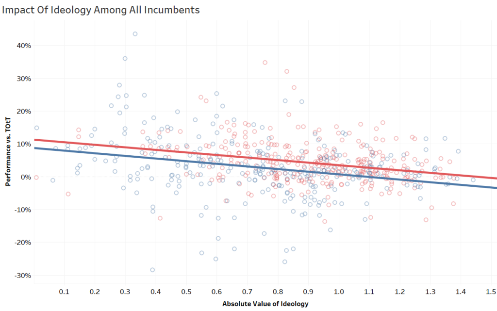
The first chart explores the relationship between ideology and performance against the top of the ticket among incumbents. On the x-axis is the DIME ideology score, where 0 is the center for the most moderate and ideological extremism increases as the axis moves to the right. On the y-axis is the performance against the top of the ticket: the House share of the vote against the Presidential share of the vote. For instance, if a Congressperson got 55% to the President’s 52% in that district, then that would be 55-52=3%. If the congressperson only got 48%, then the point would be at 48-52%. The parties are separated out here, with red being the Republicans and blue indicating a Democratic incumbent.

The chart above shows that the trend is statistically significant (both lines have a p of <.0001) and bend towards the neutral center with a slope of about -.08 as the ideology becomes more to the extreme. As an incumbent is rated more moderate, they will generally outperform by a wider margin. Conversely, as an incumbent’s ideology moves more to the extremes, their over-performance declines.
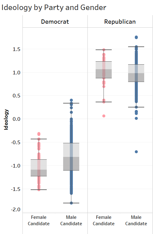
With the next chart exploring the impact of ideology, I wanted to look at to see if there were any gendered dynamics in this performance, so I isolated only the data points where the candidate was a woman. As indicated in the chart directly below, male candidates from each party were likelier to be closer to the ideological center, especially among Democrats.

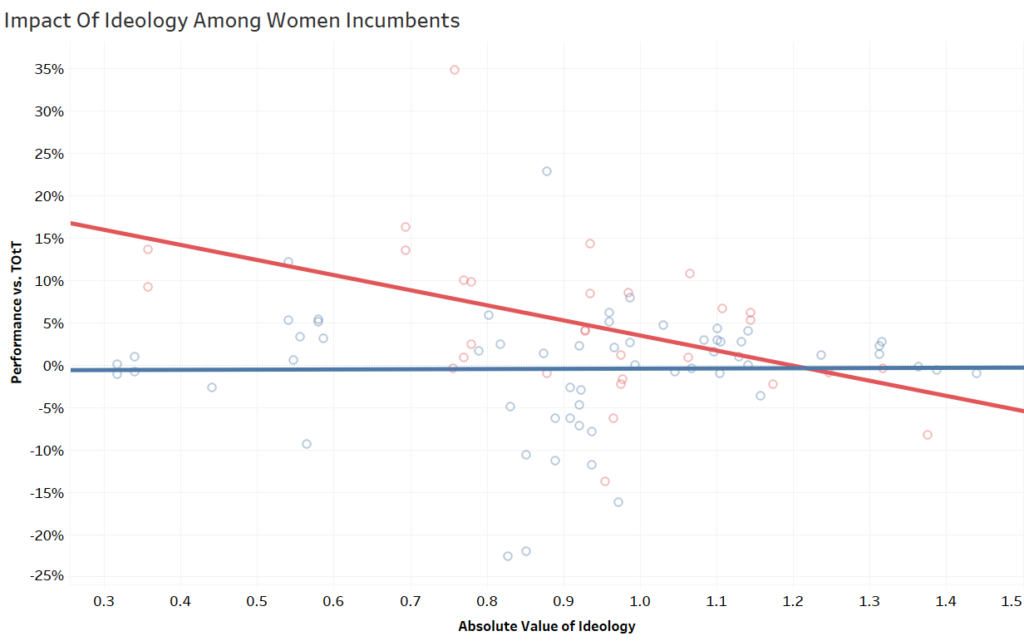
Now there were women across the ideological spectrum running in the last few cycles that aren’t/can’t be included until they are on the ballot in 2020 so this is a bit outdated and underpopulated, but still intriguing with the dataset here. Anyway, here’s the impact chart isolated to female candidates:

There’s clearly a split between the parties, but also from the first chart. Democrats see no real effect among women incumbents. Among Republicans it’s the opposite: there is still a statistically significant relationship (p=.0098) but now the slope is -.18, over twice as steep as it was with all incumbents. For female Republicans seeking office or facing re-election, there is a stronger reaction on both ends, with moderates seeing larger gains, and conservatives suffering harsher penalties. One example is the Republican data point in the bottom right corner: Michele Bachmann’s performance in MN-6 in the 2008 election. I hope to have more data points soon, but if this trend holds, it’s a fascinating look at each party’s acceptance and recruitment of female candidates, one that may come with an ideological filter to maximize election chances.
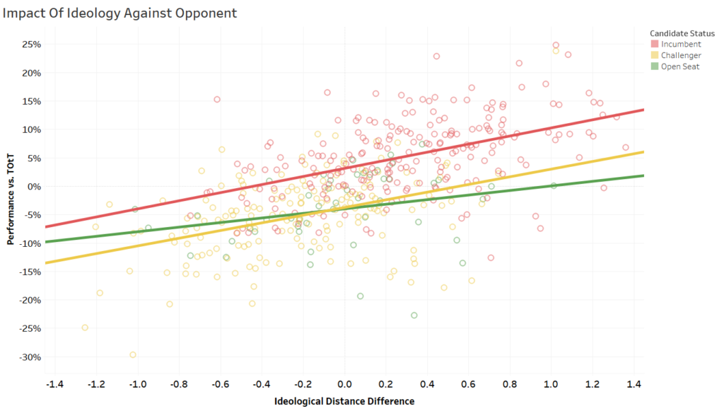
The next chart uses one of the new features of DIME scores and is, in my opinion, the most insightful. This goes beyond whether just more moderate or extreme positions are more electable- it pits them against each other. To do this, I looked at the difference between the absolute distance of both candidate’s ideologies from zero. The chart also splits the trend lines by the status of the candidate, whether they are an incumbent, challenging an incumbent, or in an open seat.

The plot above shows that it’s not just where on the ideological spectrum a candidate lies, but how close to the center they are relative to their opponent. If your opponent is closer to the dead middle, there is a penalty on your performance, but a more extreme candidate gives you a boost. There is no 2018 data, but this helps explain a lot of races, like Democratic failures in PA-1 or NE-2, while they kept it close or won a lot of seats against incumbents with moderate candidates and the flip against a Freedom Caucus hopeful in New Mexico’s 2nd. This also reinforces a belief like Duverger’s Law (not the exact principle because we do not know where the people in the district line up), that it is likely easier to build a coalition with moderate voters if you are less extreme than the other major party opponent. Lastly, incumbents typically have a few points of an inherent advantage over challengers versus two candidates in an open race so I split them up above to show that they have similar slopes but at different levels. Both the challengers and incumbents were statistically significant (p<.0001) while open seats are mostly confident with a trend under a slightly laxer measurement, just not to the exacting 95% degree (p=.067)
If this pattern holds up in recent cycles as well, there is a strong case that more ideologically extreme candidates in House races bring a penalty while moderates bring a boon. It also looks like the electorate can pick out a rough distance on who is closer to the center and will often err in their favor. This is important for recruiting but also evaluating your campaign planning and targeting. It even advocates for playing around in the other party’s primary to gain a leg up. Though I would enjoy exploring other data points, the gender dynamics by party warrants more of a deep dive into how parties react when their candidate is a woman. Overall, there appears to be an advantage in positioning towards the center when performing against the baseline of presidential performance.
NOTE: There are a lot of other trends or combinations that can be explored that I didn’t cover here, so here is an interactive dashboard with the ideology and the performance against the top of the ticket that you can check on and off boxes for different characteristics and find your own patterns
Data Citation:
Bonica, Adam. 2016. Database on Ideology, Money in Politics, and Elections: Public version 2.0 [Computer file]. Stanford, CA: Stanford University Libraries. https://data.stanford.edu/dime